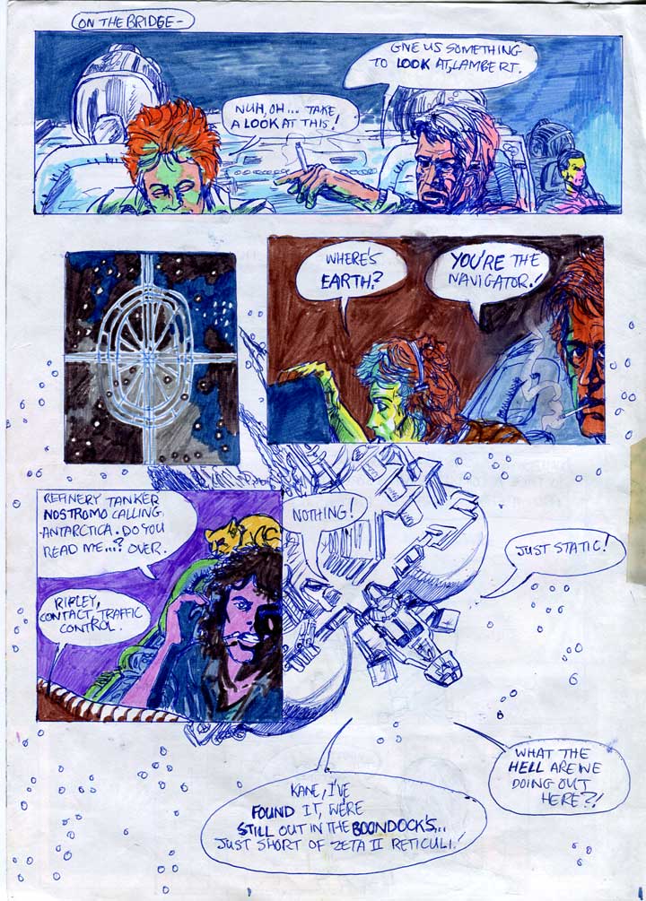
Pg.6: Where's Earth? [1982/83?]
Art Notes
Layout
From Star Wars: age 9 - check it out!
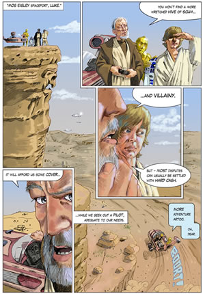
There's not much to ridicule in today's page. Sorry about that readers! Next week we'll be back to the earlier, dafter adaptation. I was about to say that you can be sure that a 13 or 14 year old didn't come up with this composition off his own bat. But actually, I just checked the Goodwin/Simmonson version and although my page heavily takes elements and even 2 frames from it; there's something completely different happening compositionally. Probably thanks to comics like 2000ad I was embracing a whole super-panel overlaid with sub-panels technique.
DC Thompson Comics
That would have been a breakthrough for me then, The comics that I read in the mid-70s, like DC Thompson's Warlord took a very straightforward, dull and probably very efficient approach to layout. It wasn't unusual to see pages with 8 absolutely equally sized boxes containing the artwork. Any expression went into the script - which was never hand-lettered, and the drawings that were squeezed into the boxes. It was still absolutely magic in my eyes though. Wow - Union Jack Jackson - and Lord Peter Flint! Someday when I win the lottery I'll buy them all again on eBay.
IPC Comics
IPC came along and eventually gave us 2000ad among others. Things got more creative. The artists fought for many years to be allowed to even sign their work. IPC had been following the DC Thompson attitude that if you put the artists' names on the stories, they might get poached (or maybe even get big ideas about themselves). Perhaps it was because the Credit Cards were slyly introduced by a kindly editor, without the boss noticing, and because they stayed - that the artists took even more pride in their work elevating the 2000ad to a cultural icon.
Reviews!
"You must read this - It's super-underground - it's all kinds of incredible - magic was made."
Peter Hall - Movies.com
More reviews»


