<transcript>
Transcript goes here. PendingCommentary Below
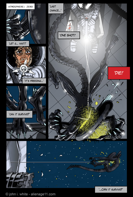
DIE! [69]
Almost there...
I was excited about this new page... but I think I rushed it. About a day / 8 or 9 hours in all? I'm really trying to blend my old version, my new pages, the film and the Alan Dean Foster novel together here and I have to say the to-and-fro between Ripley and the beast is getting a bit confusing!
Holy Ret-con
"DIE!"
I'm guilty of doing a bit of a George Lucas here. George said when he did the Star Wars Prequels, that he wanted things to "Rhyme". To me, that seems a bit silly, especially if it screws around with the original films - ret-conning them ['retrospectively-converting' for the uninitiated!].
It shouldn't even be necessary to use such tricks if your story is good anyway. I mean, it is a bit of a trick - a sort of quick-fix to make the new unfamiliar stuff seem like the old stuff - that everyone knows and loves. So you use the same theme tune, typeface, opening-crawl, scene-wipe effects, similar alien characters - even young versions of them [Greedo], and then, just to make sure that it's all blending seamlessly: you echo story elements from the old films, in the new ones. I don't like this. If anything, it dilutes the power of the original films. But what do I do?
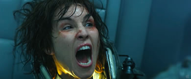
It could have been worse though. On the previous page, I had considered having Ripley do exactly the same pose as Doctor Shaw in PROMETHEUS when she slams the Airlock button - but I resisted. I gave it a lot of thought because it'd be really fun to do, but decided not to do a George on it.
Art Notes
As I said, this page took me about a day, Maybe 9 hours for everything. I was excited about it because it seemed that my fears of not matching the quality and impact of the previous couple were unfounded - after all. But now, I'm not so sure.
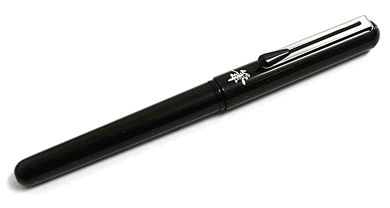
I was happy to start using the Brush Pen extensively here - and enjoyed it, but I think the whole thing was a bit rushed. I also wonder if the griddy-gutters aren't too stiff and boring? You'll notice, with the much older ones they were more adventurous and dynamic.
See « this. But I was advised by an editor from DC comics that the regular old, horizontal-vertical grid was better. "It worked for Jack Kirby, right?" she said.
"It worked for Jack Kirby, right?"
The previous page to this, I broke-out again and slanted some of the panels « here - and I think it adds impact and movement and dynamism without breaking the flow and order of the panels.
On this page, I seem to have backed-off again. Well, it's all part of the learning process. Looking forward to the next one!
Reviews!
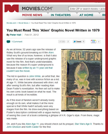
"You must read this - It's super-underground - it's all kinds of incredible - magic was made."
Peter Hall - Movies.com
More reviews»
