<transcript>
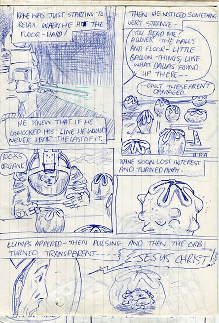
(Kane, of the Nostromo investigation team has gone into the the alien 'derelict' or 'Juggernaut' spacecraft's 'basement')
1. 'Kane was just starting to relax, when he hit the floor--hard!' (He shines his light about the gloom of what will become known as the 'egg-chamber') 'He knew that if he unhooked his line, he would never hear the last of it'
2. 'Then he noticed something strange--' "You read me?" Kane called to the others, "The walls and floor--little balloon things, like what Dallas found up there--only these aren't damaged." (We see the eggs) 'Kane soon lost interest and turned away' (no he didn't!—John)
3. (Kane peers in at one of them ) "Looks organic."
4. (The 'egg' begins to pulse and move, bulges appearing)
5. 'Lumps appeared--then pulsing and then the orb turned transparent--' (Kane sees a creature inside it—the facehugger' "Jesus Christ!" he yells.
Commentary Below
"Looks organic..." [11]
Poor Kane. It looks as if his time's nearly up. Guess he'd never heard the old saying: curiosity killed the idiot.
The egg design is curious. they look like poppy seed pods to me. But it seems that Giger had something else in mind. His first design had an opening on the top like - er, ladies' parts. He enthuses over his loving attention to detail in ALIEN Film Design, and recalls how he unveiled the design to howls of laughter from the team. Scott thought "it was too good." But he was still urged to try an alternative concept; because a major proportion of the audience would be in Catholic countries. "Something more like a flower opening" was O'Bannon's original imagining. But rather than remove the controversial element, Giger's solution was to add another one! Doubled: one across the other. Giger says:
"Seen from above it would form a cross, which people in Catholic countries are so fond of looking at."

Another reference - of about 10 or 11 - for the comic's artwork
Art Notes
Yes, with my only visual and narrative reference being from the novel, the creature does indeed have an eye! Doesn't he look funny in blown-up biro?
Now don't laugh: yes, that is indeed an eye.
Giger's designs do feature what looks like an eye. This is a terrific scene in the film - and the book. Alan Dean Foster has been really getting into his stride after a fairly protracted and monotonous first 50 pages:
"That eye... if it was an eye and not simply some shiny excrescence...deserved a closer look (...) Despite the feeling of repugnance churning in his belly, he moved still closer and raised the light for a better view.
The eye moved and looked at him.
From the novel
Reviews!

"You must read this - It's super-underground - it's all kinds of incredible - magic was made."
Peter Hall - Movies.com
More reviews»
By the same creator!